Pagsmile

UX / UI / Project Management
Project Overview
Pagsmile is a fintech operating cross-border payments, LPMs (local payment methods) and payouts. Main merchants are in the gaming and online marketplace industries.

We want to position this product as the best and most used check-out in Latin America and further expand our financial services.

----------

RESULTS

The checkout
- 28.08% increase in MAU in 60 days ⬆️

The website
- Generated an average of 500 leads per month 💰

The dashboard
- Still needs a UX Scorecard (TBD 🛠)
JTDB
- Updating interfaces (website, merchant dashboard, checkout)
- Copywriting and localization to English, Portuguese, Spanish and Chinese
- Establishing KPIs and User Research culture
- Working with international contributors in different timezones and languages

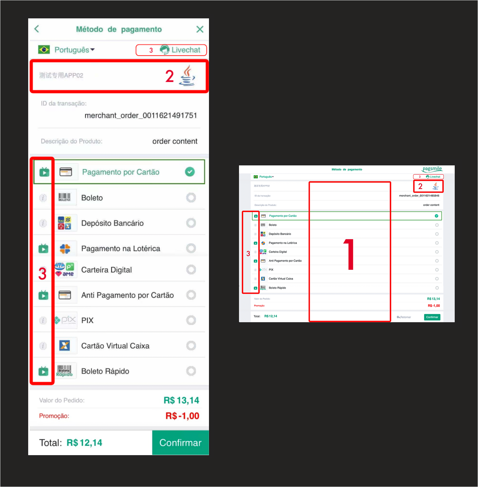
1) White space is often recommended but in this case the distance between the correlated information diminishes usability

2) The general end used doesn't have any interest in which coding language is being used

3) The platform has two methods of helping the user: a live chat and a video. These should have a heavier/clearer weight in the UI.

👇
01
UX Audit
Even though user research would be in place to discover the user's unfulfilled needs and wants, I had to compromise since the stakeholders were eager to have a fresher look asap.

For the 3.0 version I hope to convince them to invest in a more by-the-book design method.
02
Redesign
The following are the proposed key performance metrics I've identified as worthwhile for the product.
03
KPIs
Together with the customer-facing checkout revamp, the second redesign was for our merchants. Being a 2B product this time, it proved to be with a deeper level of complexity.
04
Dashboard